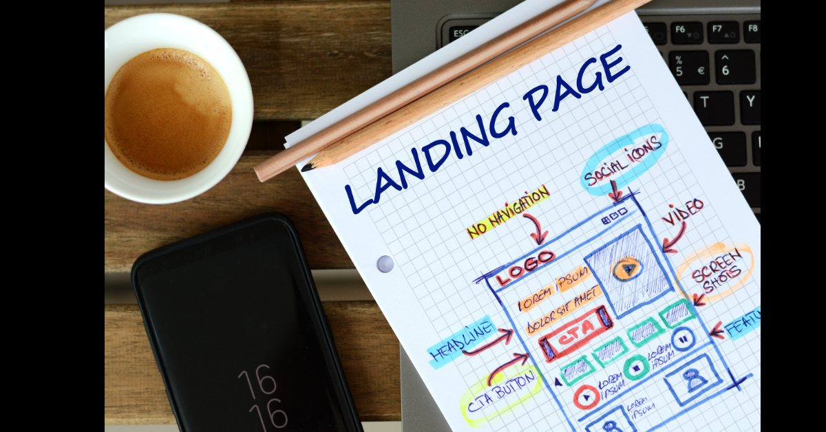
Websites are great for connecting business to customers, and informing them about anything and everything they do. But, when it comes to cold, hard conversion, nothing really beats a landing page, with a singular purpose and call to action.
Unlike websites, landing pages are focused less on informing potential customers, and more on persuading them to carry out a desired action. This might be signing up for a free trial, giving you their email address, filling out an enquiry form, or buying a product or service.
In this blog, we jump into 7 effective tips you can use to ensure that your landing page is one that can convert a stranger into a prospect, a prospect into a customer or, even better, an advocate for your brand.
1. Craft a clear call to action
Everything on your landing page is to drive your audience to the Call-to Action (CTA), so it has to be disruptive and catchy. Your CTAs need to be the focal point of the page, and designed to catch your reader’s attention.
Here we are using 'action' to describe what we want the user to do on the landing page, which could be to click a button, watch a video, fill out a form, or to interact with the page content in some way.
If you’re thinking of adding content below the fold (which refers to the part of the webpage a user must scroll down to see), simply duplicate the CTA and place it below (or an anchor link back to the CTA) so your audience won’t have to scroll back up to click on it. A big part of a CTA is the content itself, as it tells your audience what you want them to do. Use demanding tones like ‘sign up now’ or ‘get your free trial today’ to create a sense of urgency, and persuade them to act quickly.
.png?width=388&name=Screenshot%20(198).png)
2. Include an offer that’s too good to refuse
So your reader is on the landing page, what are you offering them in exchange for their details? Consumers are hesitant to give out their contact information, as they end up having an inbox swamped with marketing promotions. The only time consumers will give their details is when the value of the offer is worth more than their contact information. Your offer needs to have a clear and simple design that tells your audience everything they need to be convinced to carry out the desired action.
Here we are offering a free 2 hour strategy session so it's pretty valuable. We'd want to know a bit about who you are before we commit to it, so we'd be justified in asking for your Company name, location, role, etc in addition to your basic contact info:.png?width=750&name=Screenshot%20(207).png)
3. Keep it short and simple
As a consumer, you’ll know just how off-putting long forms are – when presented with too much or info, you end up closing the window. So use as short a form as possible and only ask for information that you really need. Be sure to only include content that’s relevant and straight to the point, and remove anything else on the landing page that could pose as a distraction to the CTA.
.png?width=500&name=Screenshot%20(205).png)
4. Convey your unique selling point to your customers
The best way to successfully engage with your customers and sell to them is to put yourself in their shoes. Your prospect needs to understand the value you bring to the table, and your landing page has to show how it sets you apart from your competitors. Having the best features of your offer/product/service, how it can benefit them, and the problems it can solve, will help to sell yourself to the audience. Don’t forget to throw in a few pictures and icons to illustrate this and bring it to life, but don’t steal the spotlight from your CTA..png?width=540&name=Screenshot%20(199).png)
5. Write a strong headline
The headline is the first thing that catches their attention, so it has to be a showstopper. A clear, strong and compelling headline grabs their attention, informs them exactly what the content is about and convinces them that it is of value to them. Outbrain discovered that using negative words like “never” and “worst” outperform positive words like “always” and “best”... by 63%. So use headlines like “5 worst foods to eat for weight loss” as they will grab more attention than “5 best foods to eat for weight loss”.
6. Implement a clean, concise and simple design
Without an amazing design to complement your content, your readers won’t find the page compelling enough to stay. In fact, if you add too many design elements they might not even wait for it to load!
A clean, concise and simple design goes a long way to bring the words on the page to life, and makes the CTA pop. If you’re looking to communicate key information, bullet points, bold, italics and highlights help to grab the readers’ attention with a straight-to-the-point message. With the help of white space, you can break up the sections into bite-sized bits to keep your audience engaged.
Videos on your landing page pack a punch, so adding them in can boost your conversions up by up to 80%. Humans can retain 95% of a message when they watch it through a video, as opposed to 10% when they’re reading the text, and 60% of visitors would much rather watch a video as it’s less of an effort than reading. A critical aspect of a converting landing page is its loading time. A fast load speed will give you a better response rate from your audience, but a slow one could put people off, especially if they’re busy bees!
.png?width=1000&name=Screenshot%20(201).png)
7. Show your social proof
Consumers have a greater appreciation for a brand if it’s trustworthy and approved by their peers, so it’s in your best interest to display your social validation. But this space isn’t limited to the customers you have, you can also include reviews, quotes, logos of other businesses you’ve worked with and any awards or prizes you’ve won. Your social proof can also be displayed in the form of social media likes and comments, total number of customers and anything else to showcase your validity in society.
.png?width=878&height=336&name=Screenshot%20(209).png)
To wrap up...
Using these 7 tips as a guide, take a look at the landing pages you are currently driving your traffic to, and see what can be improved. If you don’t yet have landing pages, make these hot tips your checklist! Once you get your landing page converting at a decent rate, don’t put your feet up and stop there - it’s important to constantly analyse the data and improve your landing page so it keeps converting as the market changes.
If you’re looking to create a landing page that can convert, get in touch with us today! We’ve got a highly skilled team who can help you ideate and create an offer that will compel your potential customers to give you their information. And we can do the writing, designing, building and optimising your landing page to improve the Return on Investment (ROI) of your marketing efforts.

.png?width=550&name=Screenshot%20(213).png)


.jpg)
Comments